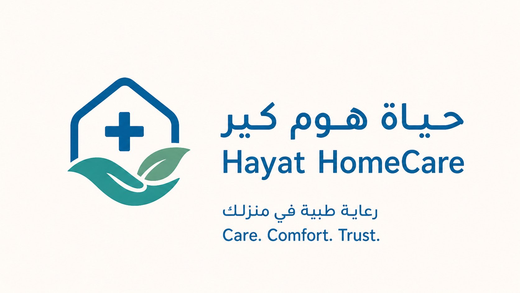
قصة العلامة The Story
"حياة هوم كير" شركة سعودية تقدّم خدمات الرعاية الطبية للمرضى وكبار السن في منازلهم بمعايير المستشفيات. صممنا هويتها لتحمل قيمتين متلازمتين: الكفاءة الطبية المُطمئنة، والإحساس الإنساني الدافئ الذي تستحقه الرعاية المنزلية. Hayat HomeCare is a Saudi company providing hospital-grade medical care to patients and the elderly in their own homes. We crafted its identity to carry two intertwined values: reassuring medical competence, and the warm human touch that home care deserves.
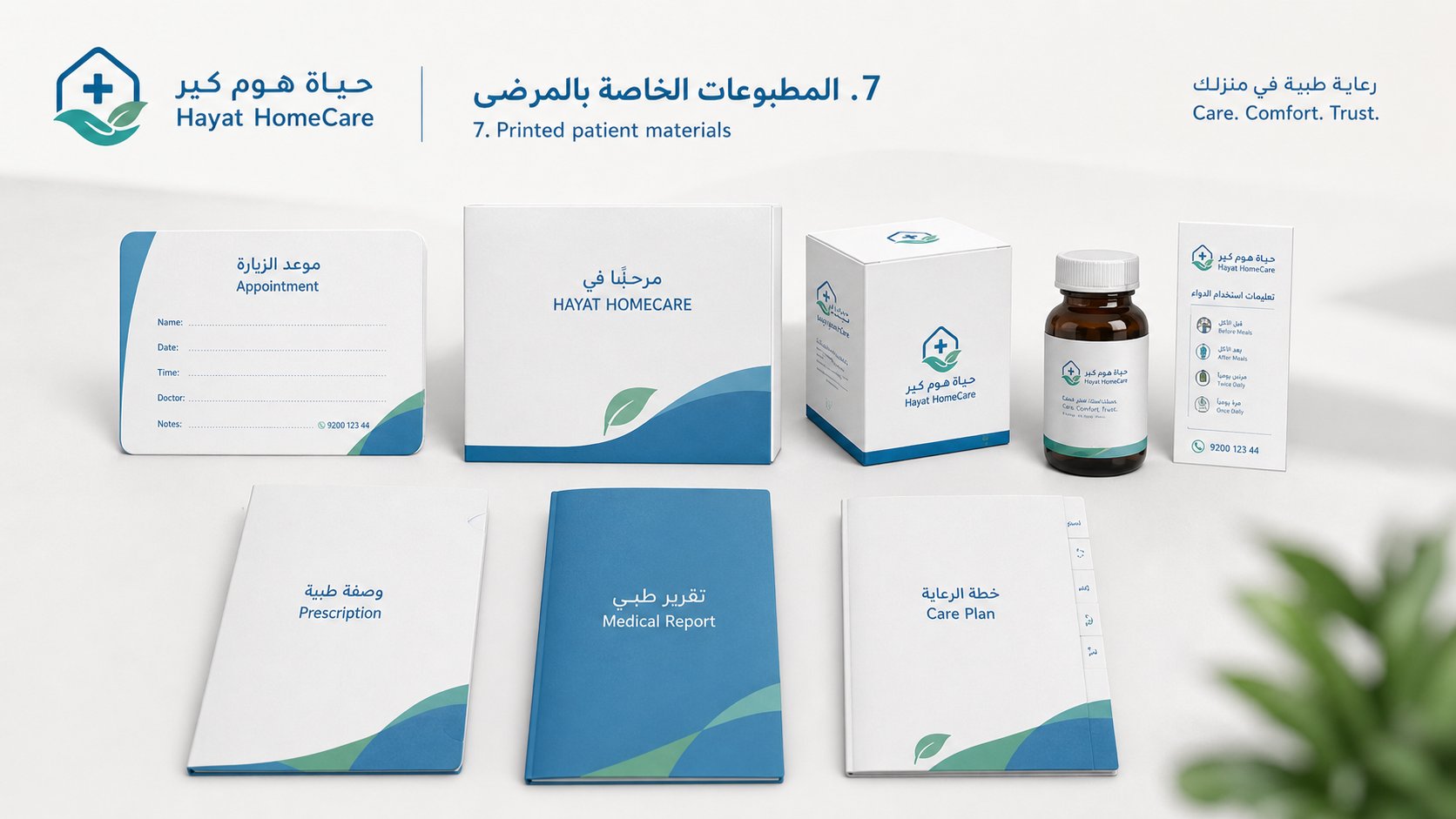
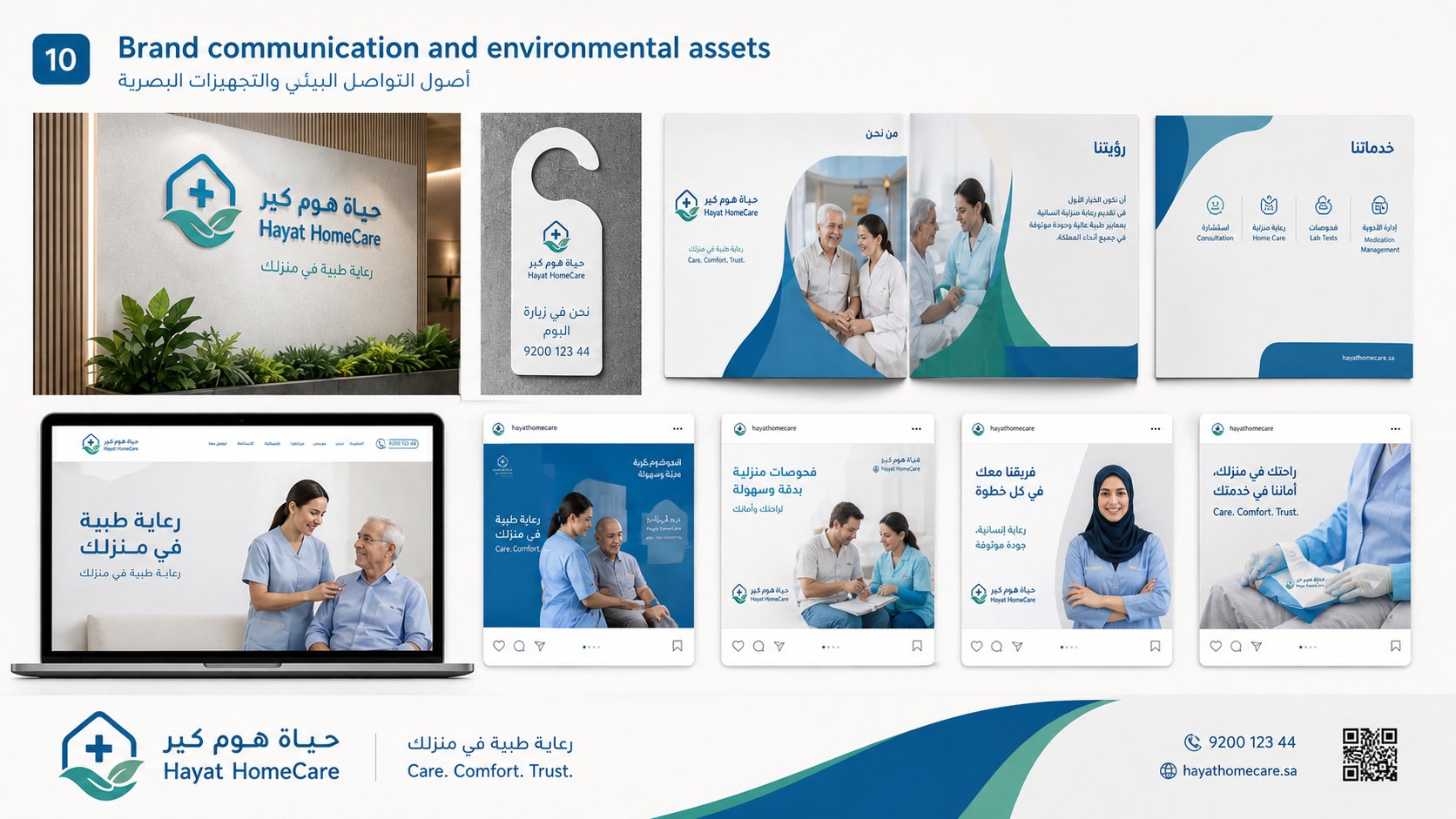
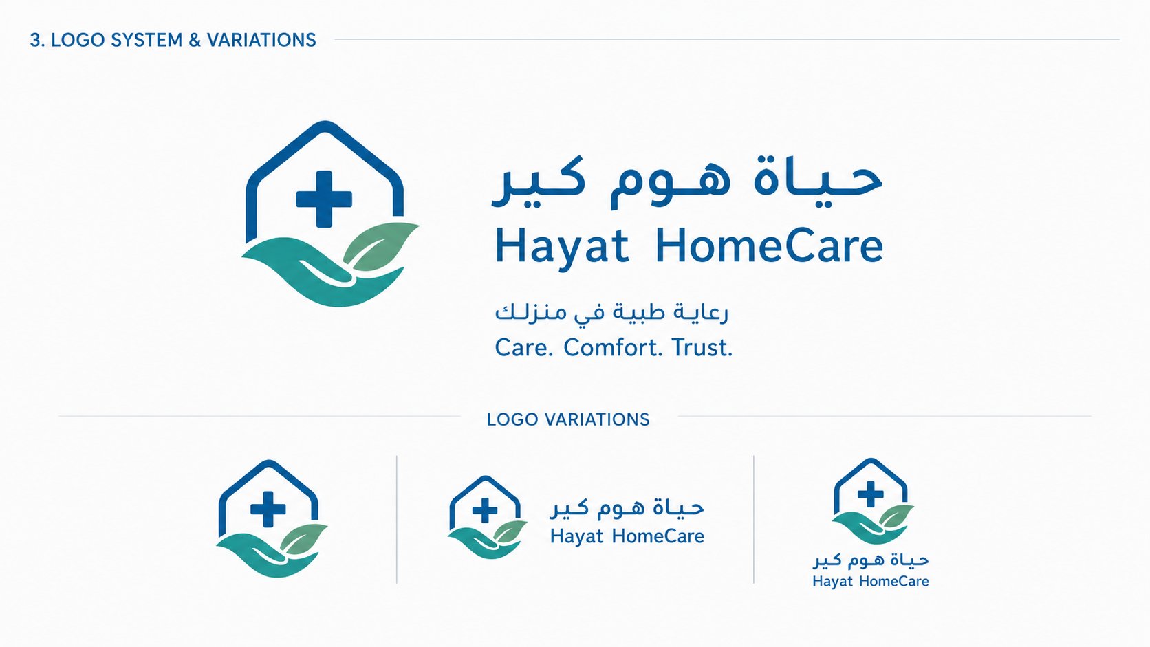
الشعار يجمع بين رمز المنزل وعلامة الإسعاف الطبي وورقة شجر تعبّر عن العافية، في تكوين هندسي بسيط مدعوم بنظام بصري ثنائي اللغة (عربي/إنجليزي) ومتسق عبر جميع نقاط الاتصال. The logo merges a house silhouette, a medical cross, and a leaf symbolizing wellness in a simple geometric mark, supported by a fully bilingual (Arabic/English) visual system that stays consistent across every touchpoint.
المعادلة الصعبة The Tough Equation
التحدي الأكبر في قطاع الرعاية المنزلية هو الموازنة بين شيئين متعارضين بصرياً: المظهر الطبي الجاد الذي يبثّ الثقة من جهة، والشعور المنزلي الدافئ الإنساني من جهة أخرى. أغلب هويات هذا القطاع إما "شديدة الطبية" فتبدو باردة كالمستشفى، أو "شديدة الدفء" فتفقد المصداقية الطبية. The biggest challenge in home healthcare is balancing two visually opposing forces: a serious medical aesthetic that conveys trust, and the warm, human, home-like feeling of personal care. Most brands in this sector either lean too "clinical" — feeling cold like a hospital — or too "soft" — losing medical credibility.
رؤيتنا الإبداعية Our Creative Vision
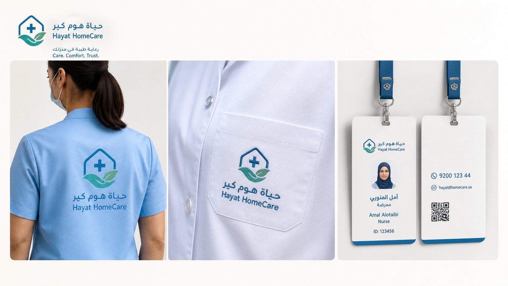
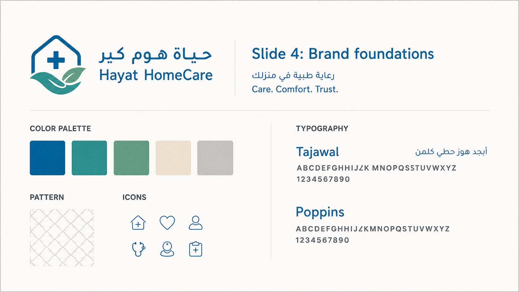
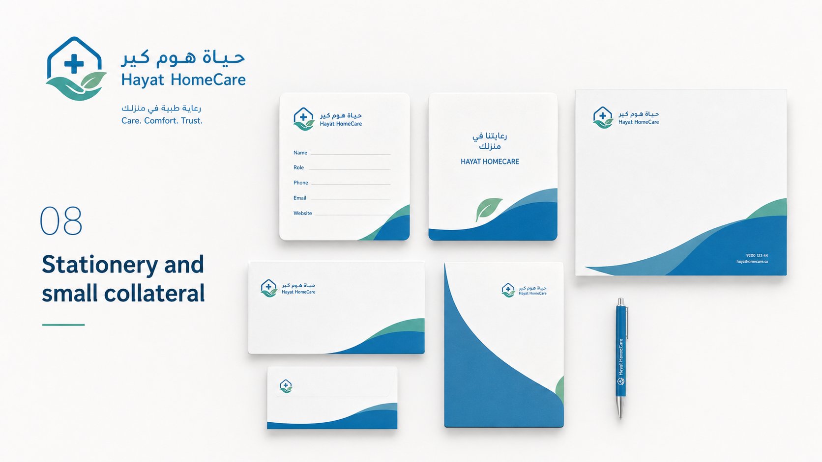
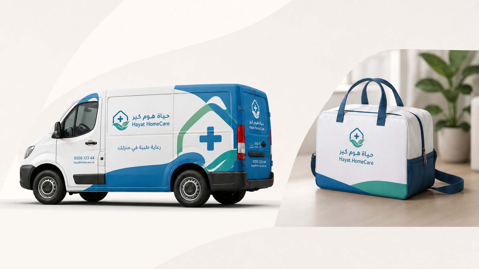
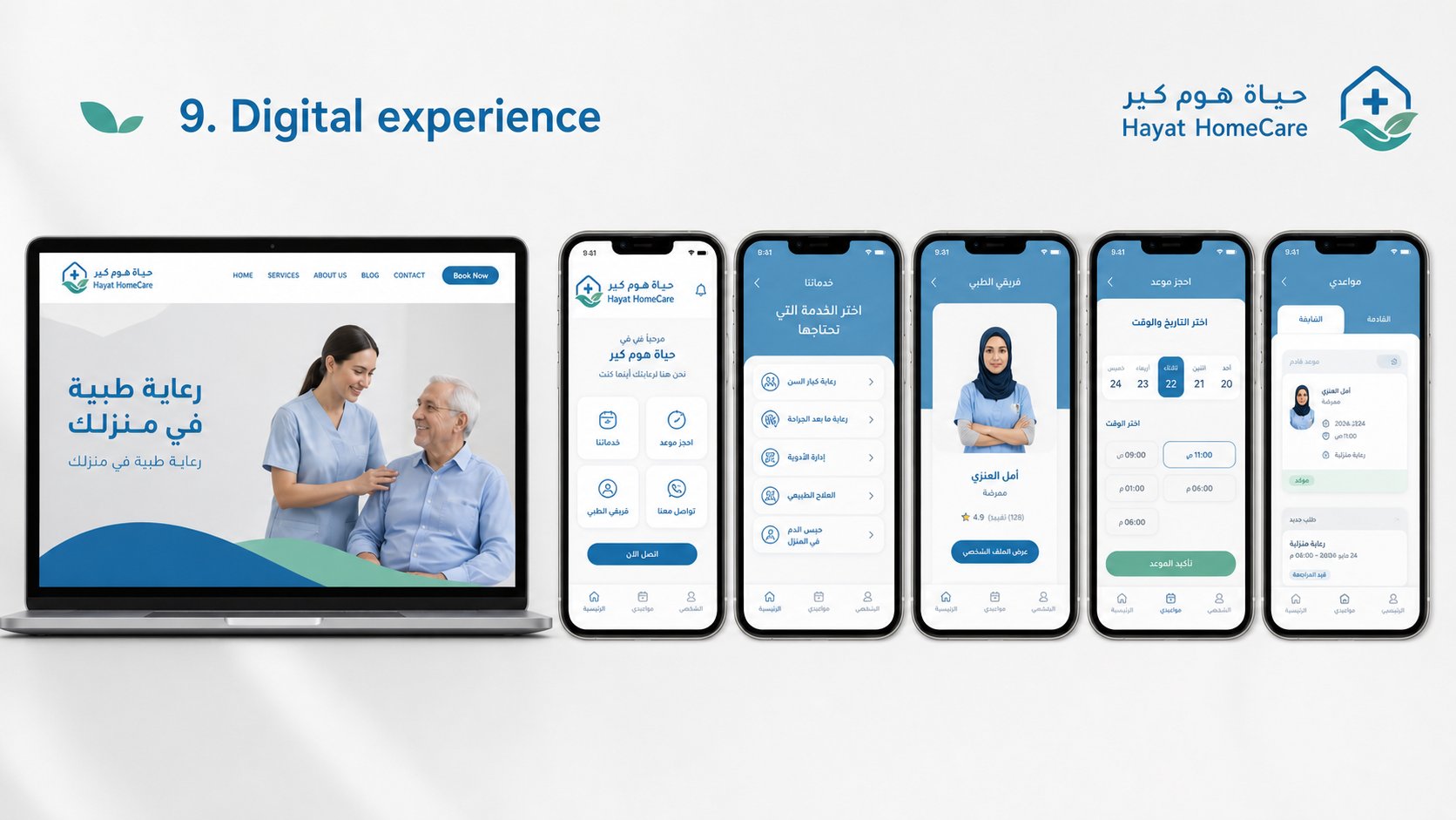
بنينا الشعار حول تكوين يجمع ثلاثة رموز: المنزل (للرعاية المنزلية)، علامة الإسعاف (للكفاءة الطبية)، وورقة الشجر (للعافية والحياة). اخترنا الأزرق الطبي مدعوماً بتدرجات تركوازية وخضراء لكسر برودة اللون الطبي التقليدي. كل التطبيقات — من الزي إلى السيارة إلى التطبيق — مصممة لتشعر المريض بأن من يدخل بيته فريق محترف لكنه أيضاً ودود وقريب. We built the logo around a composition of three symbols: a house (for home care), a medical cross (for clinical competence), and a leaf (for wellness and life). Medical blue was chosen as the anchor, supported by teal and green tones that soften the typical clinical coldness. Every application — from uniforms to the van to the mobile app — is designed so the patient feels the visiting team is both highly professional and genuinely warm.