عن المشروعAbout the Project
قصة العلامة
The Story
"آفاق كابيتال" شركة سعودية تقدّم استشارات مالية واستثمارية للمؤسسات والشركات الكبرى، بمكاتب في الرياض وجدة والخبر. صممنا هويتها لتعكس قيم القطاع المالي الراقي: الفخامة الهادئة، الاستقرار طويل الأمد، والثقة المؤسسية التي تحتاجها قرارات بمليارات الريالات.
Afaq Capital is a Saudi firm providing financial and investment advisory services to large institutions and corporations, with offices in Riyadh, Jeddah, and Al Khobar. We crafted its identity to reflect the values of the high-end financial sector: quiet sophistication, long-term stability, and the institutional trust required for billion-riyal decisions.
الشعار يجسّد ثلاثة أبراج صاعدة بأسلوب معماري معدني فضي يوحي بالنمو والطموح والاستقرار، مدعوماً بنظام بصري يجمع لوحة ألوان كحلية فاخرة، خط Playfair Display للإنجليزية وخط Tajawal للعربية، وأنماط شبكية هندسية ذهبية تعزز الإحساس بالرقي.
The logo embodies three rising towers in a refined silver architectural style suggesting growth, ambition, and stability, supported by a visual system combining a sophisticated midnight navy palette, Playfair Display for English and Tajawal for Arabic, and golden geometric grid patterns that reinforce a sense of refinement.
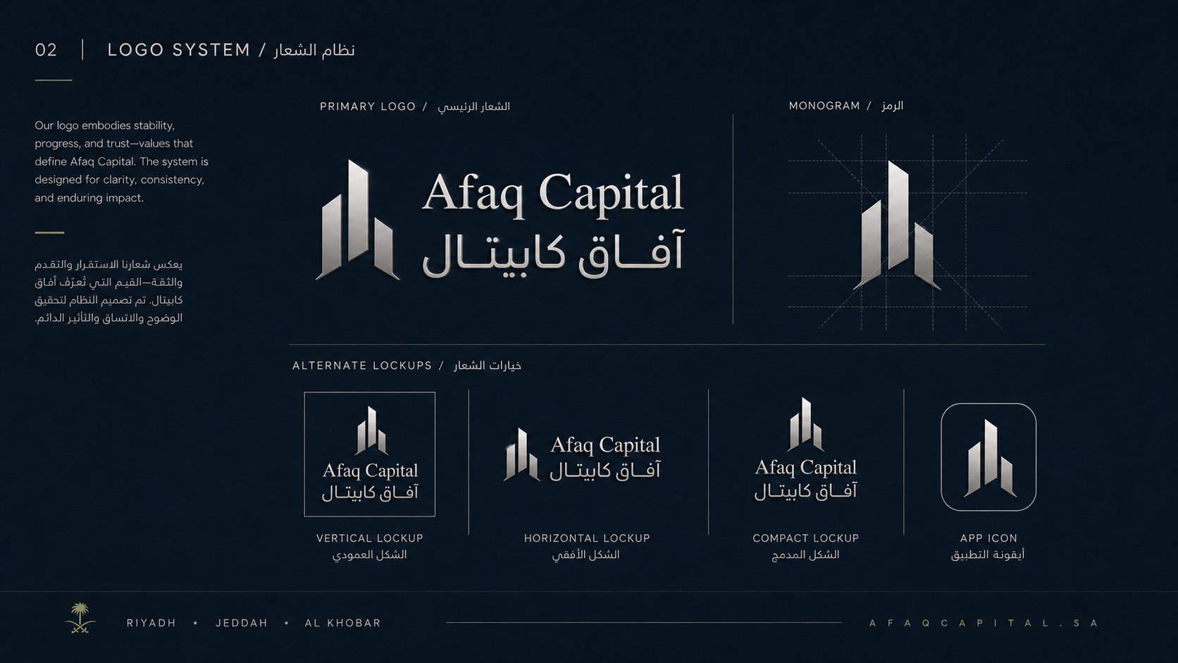
نظام الشعار — الشعار الرئيسي ثنائي اللغة، الشبكة الهندسية للرمز (Monogram)، والتنويعات البديلة (الشكل العمودي، الأفقي، المدمج، أيقونة التطبيق).
Logo system — primary bilingual lockup, the monogram construction grid, and alternate lockups (vertical, horizontal, compact, and app icon).
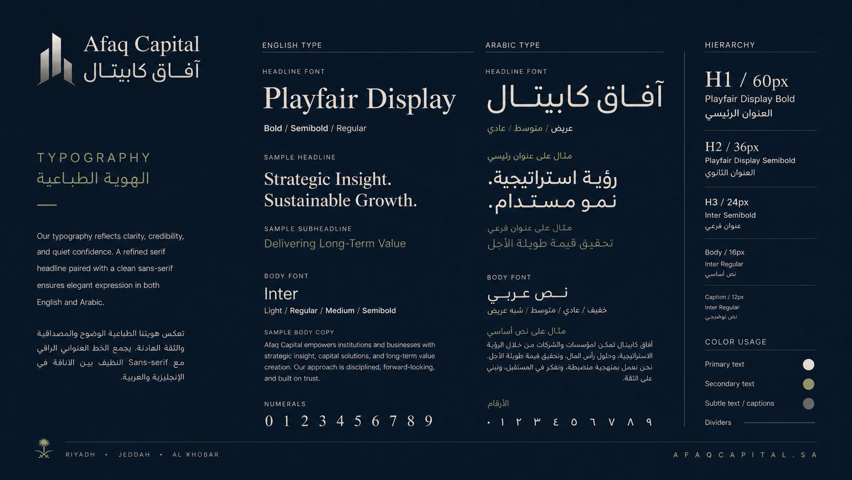
الهوية الطباعية — Playfair Display للعناوين الإنجليزية و Tajawal للعربية كخط رئيسي، مع Inter كخط ثانوي للنصوص. هرم بصري واضح من H1 حتى Caption مع لوحة استخدام الألوان.
Typography system — Playfair Display for English headlines paired with Tajawal for Arabic, with Inter as the body typeface. A clear hierarchy from H1 to Caption, plus a color usage guide.
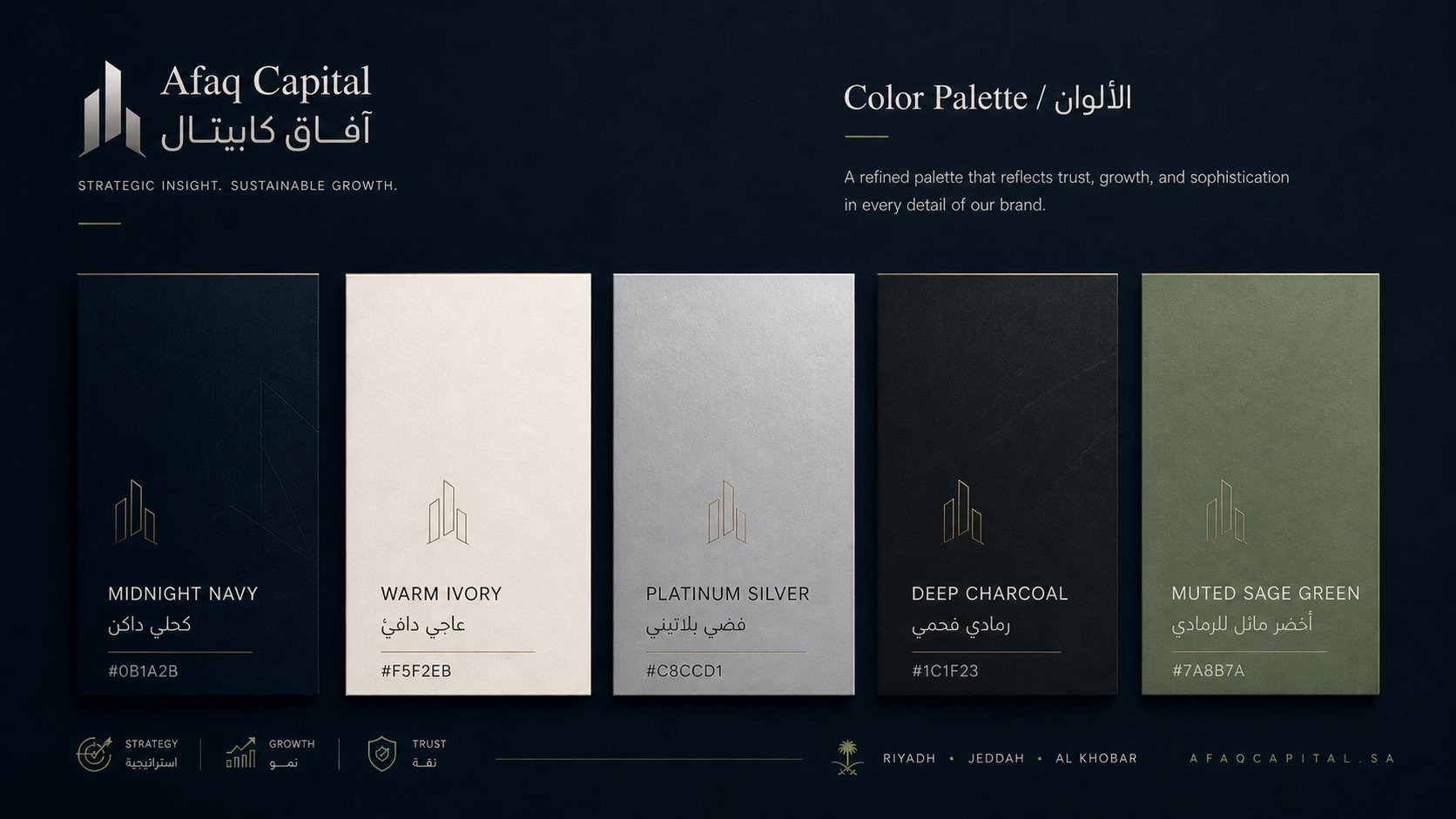
لوحة الألوان — خمس درجات راقية: كحلي داكن (#0B1A2B)، عاجي دافئ (#F5F2EB)، فضي بلاتيني (#C8CCD1)، رمادي فحمي (#1C1F23)، وأخضر مائل للرمادي (#7A8B7A) — تعكس الثقة والنمو والرقي.
Color palette — five refined tones: Midnight Navy (#0B1A2B), Warm Ivory (#F5F2EB), Platinum Silver (#C8CCD1), Deep Charcoal (#1C1F23), and Muted Sage Green (#7A8B7A) — reflecting trust, growth, and sophistication.
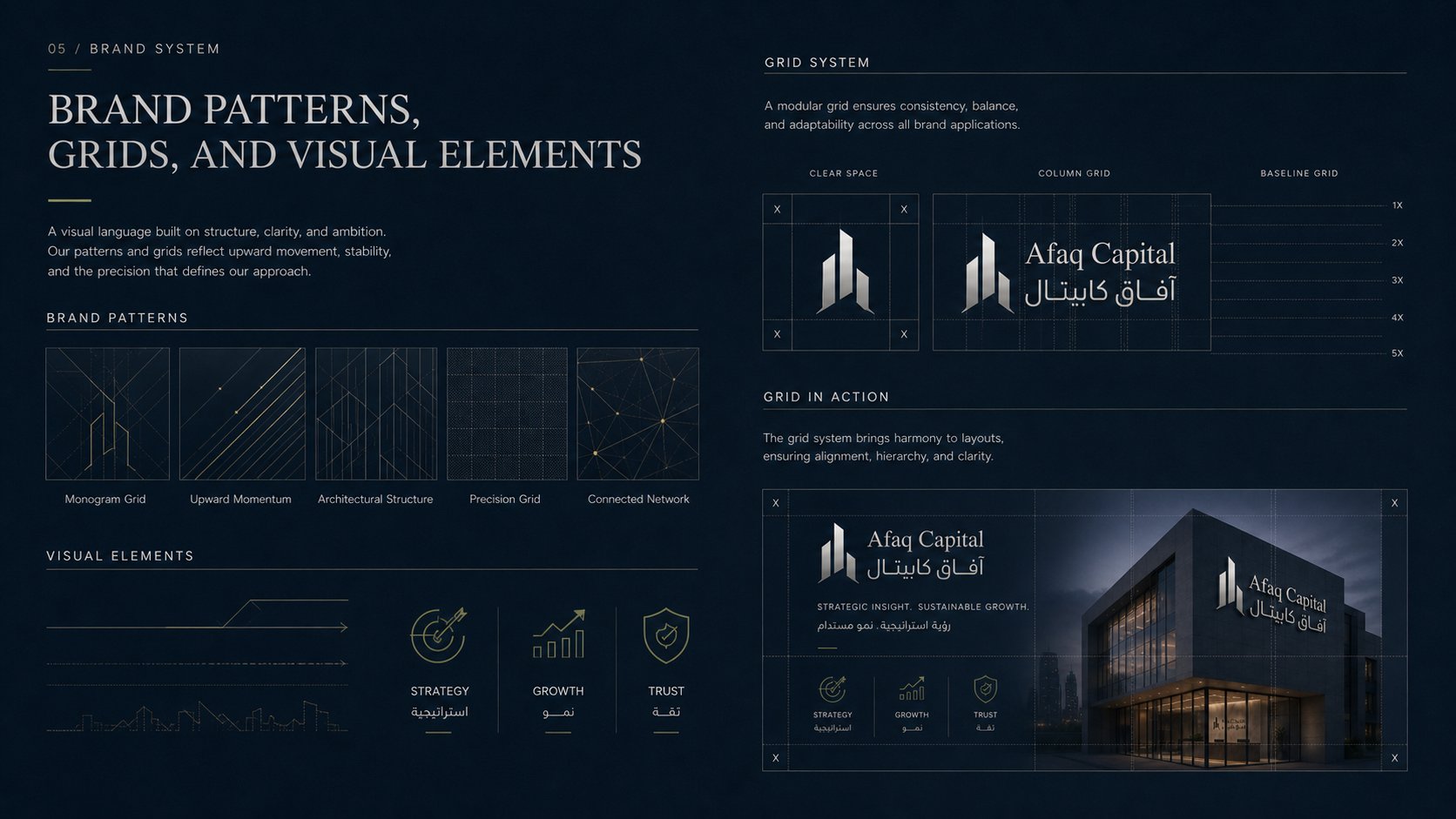
الأنماط والشبكات والعناصر البصرية — خمسة أنماط هندسية ذهبية (Monogram Grid، Upward Momentum، Architectural Structure، Precision Grid، Connected Network)، مع نظام شبكي معياري وأيقونات الاستراتيجية والنمو والثقة.
Brand patterns, grids & visual elements — five geometric gold patterns (Monogram Grid, Upward Momentum, Architectural Structure, Precision Grid, Connected Network), plus a modular grid system and Strategy/Growth/Trust iconography.
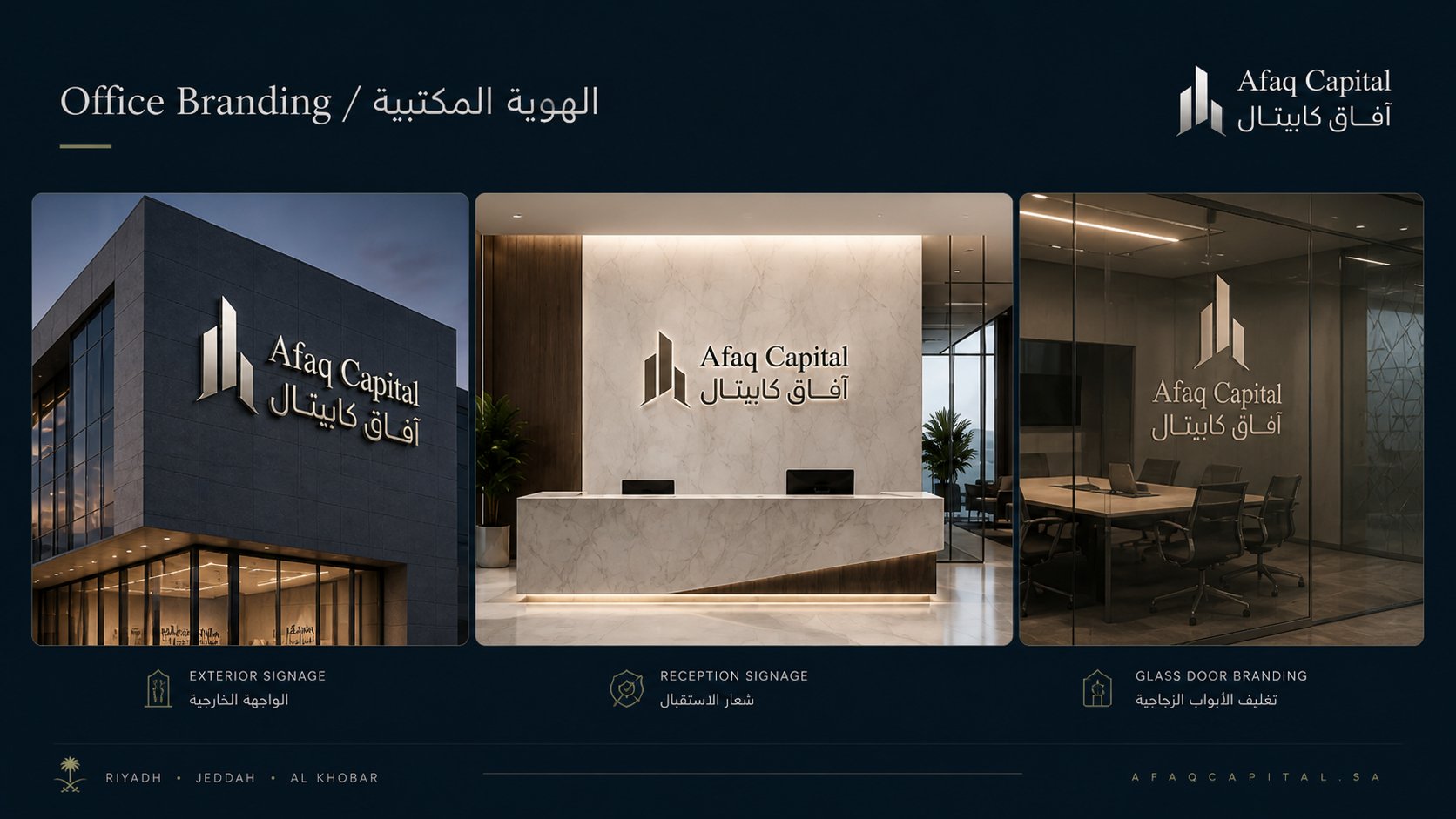
الهوية المكتبية — تطبيق الشعار على الواجهة الخارجية للمبنى، شعار منطقة الاستقبال الرخامية، وتغليف الأبواب الزجاجية بأنماط هندسية محفورة.
Office branding — exterior building façade signage, marble reception wall logo, and glass door branding with etched geometric patterns.
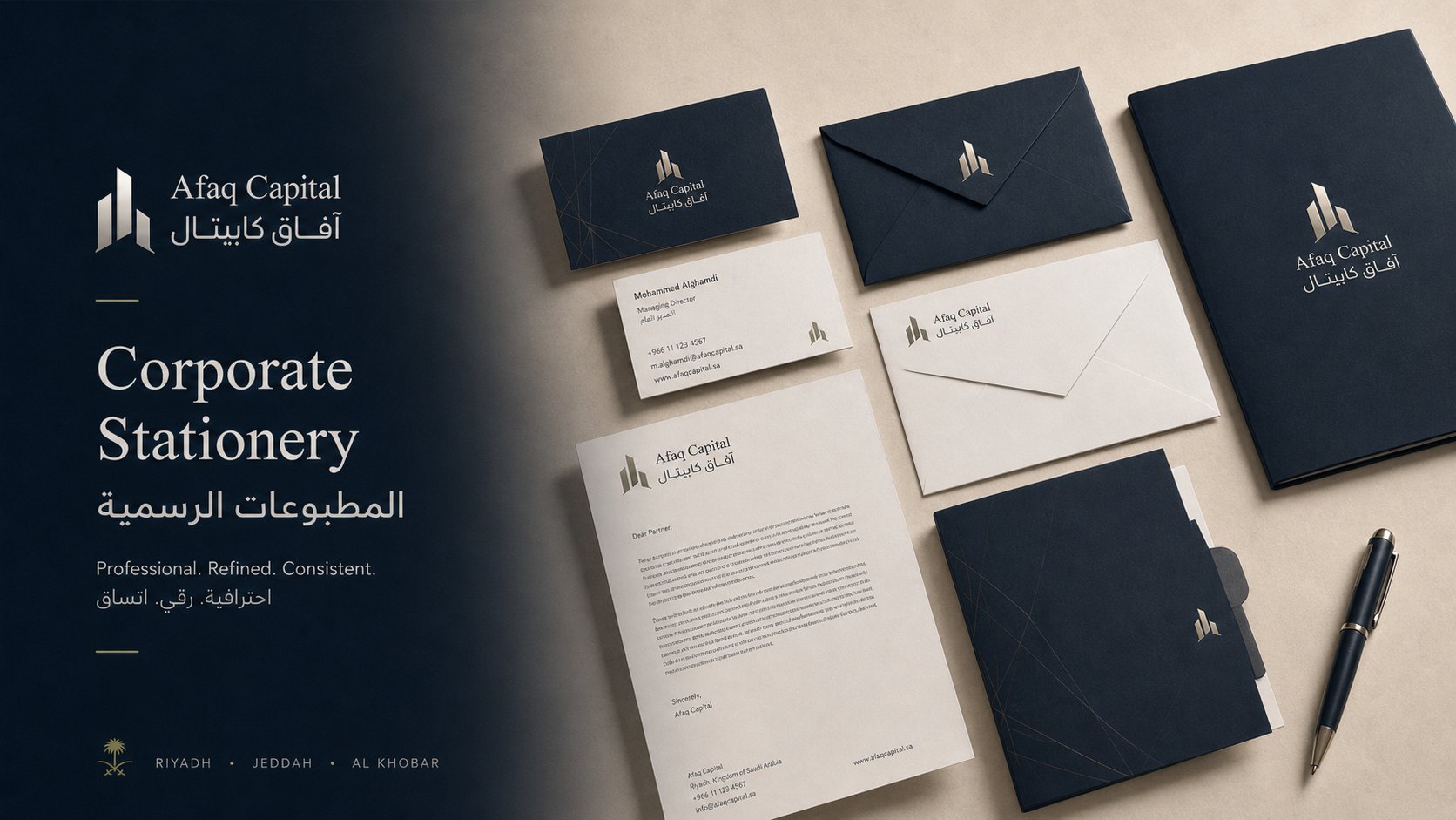
المطبوعات الرسمية — بطاقات الأعمال، الأظرف، الأوراق الرسمية، والمجلدات بطباعة فضية على ورق كحلي فاخر مع تفاصيل ذهبية تعكس قيم الاحترافية والرقي والاتساق.
Corporate stationery — business cards, envelopes, letterhead, and folders with silver foil printing on premium navy paper and gold accents reflecting professionalism, refinement, and consistency.
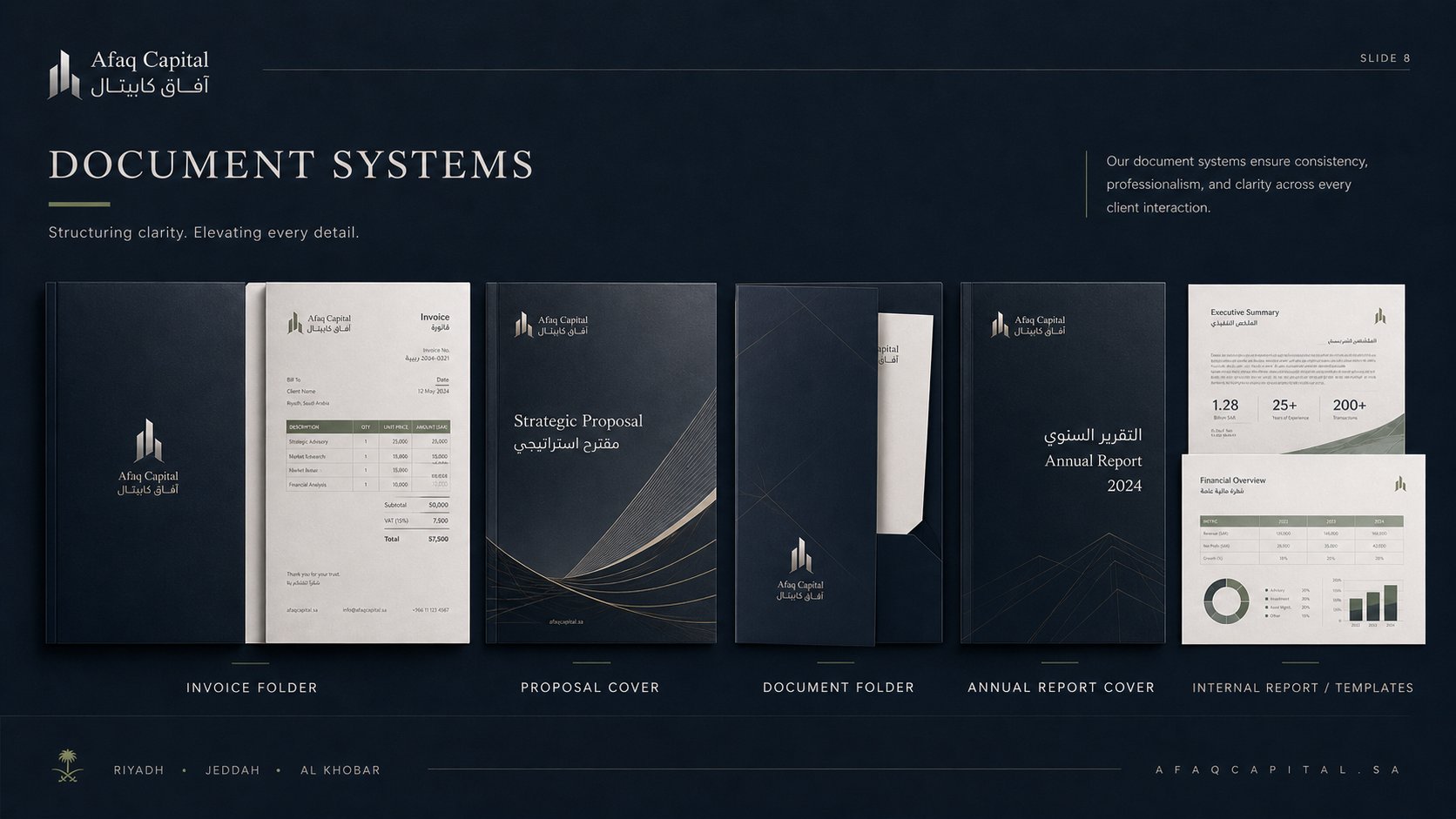
نظام المستندات — مجلد الفواتير، غلاف المقترحات الاستراتيجية، مجلد المستندات، غلاف التقرير السنوي، وقوالب التقارير الداخلية بهوية موحدة تعكس الوضوح والاحترافية في كل تفاعل مع العميل.
Document systems — invoice folder, strategic proposal cover, document folder, annual report cover, and internal report templates — unified to convey clarity and professionalism in every client interaction.
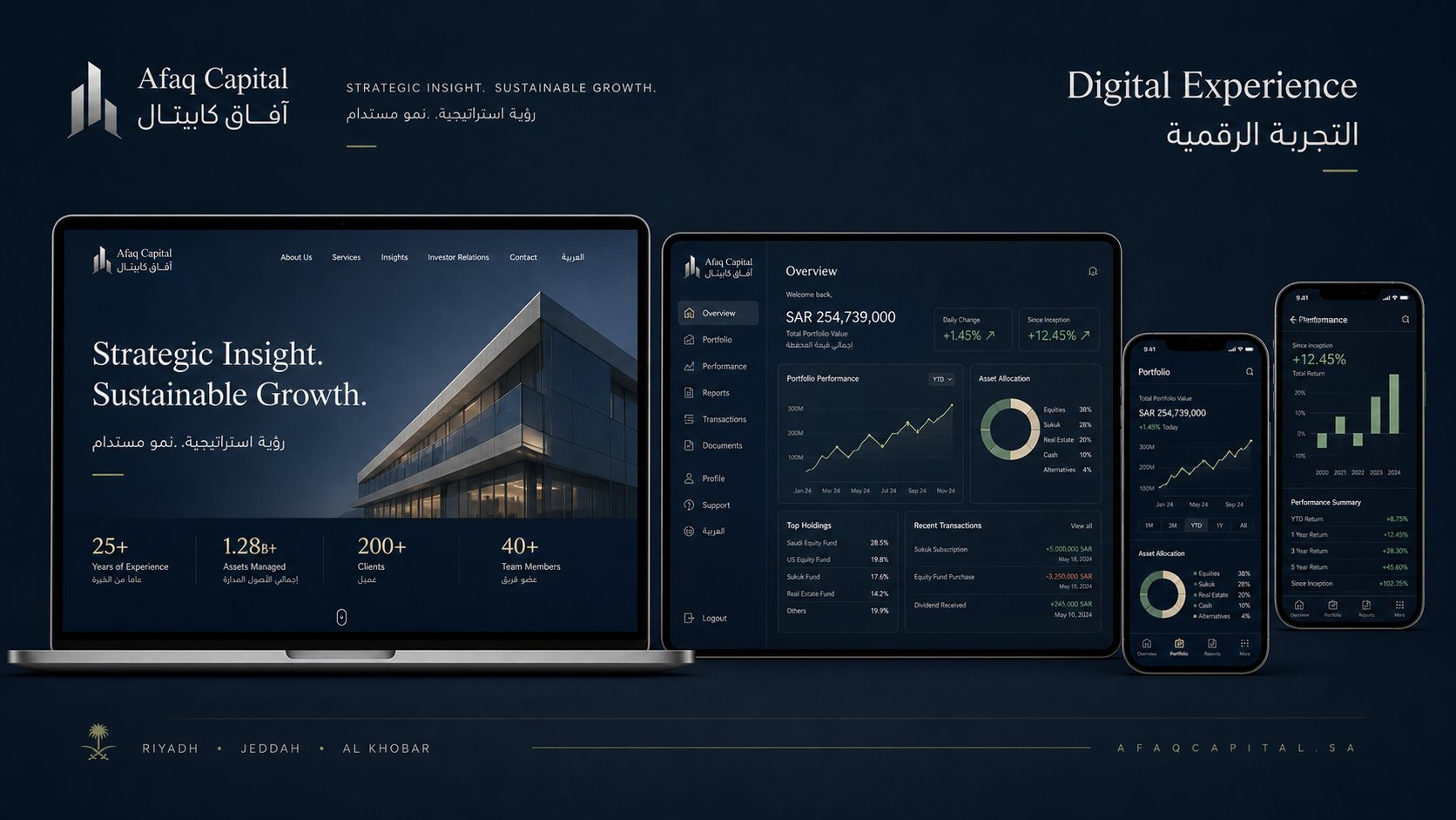
التجربة الرقمية — موقع الشركة الإلكتروني (إنجليزي وعربي)، لوحة تحكم العميل لإدارة المحفظة الاستثمارية، وتطبيق الجوال لمتابعة الأداء والتقارير في الوقت الفعلي.
Digital experience — corporate website (English & Arabic), client portfolio dashboard, and mobile app for real-time performance and report tracking.
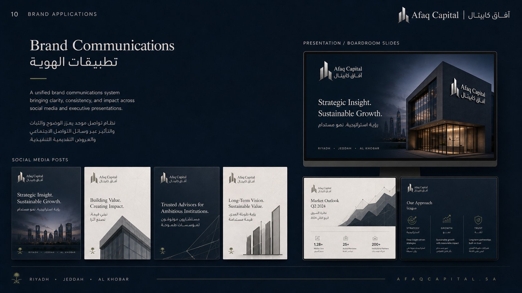
تطبيقات الهوية — منشورات السوشال ميديا (Strategic Insight، Building Value، Trusted Advisors، Long-Term Vision)، وشرائح العروض التقديمية للمجالس التنفيذية وغرف الاجتماعات.
Brand communications — social media posts (Strategic Insight, Building Value, Trusted Advisors, Long-Term Vision), plus executive presentation and boardroom slide templates.
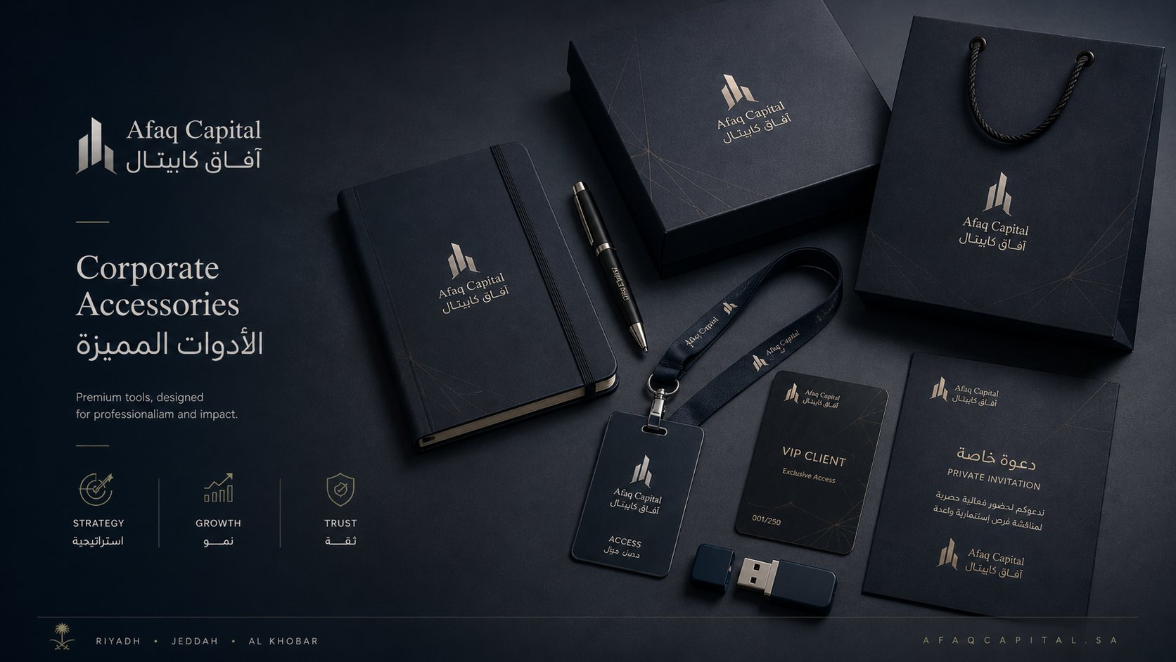
الأدوات المميزة — دفتر ملاحظات جلدي، قلم فاخر، علاقة بطاقة، فلاش USB، بطاقة VIP للعملاء المميزين، ودعوة خاصة للفعاليات الاستثمارية الحصرية، وحقيبة هدايا بنقوش ذهبية.
Corporate accessories — leather notebook, premium pen, lanyard ID, USB drive, VIP client card, exclusive event invitation, and gift bag with gold-foil patterns.
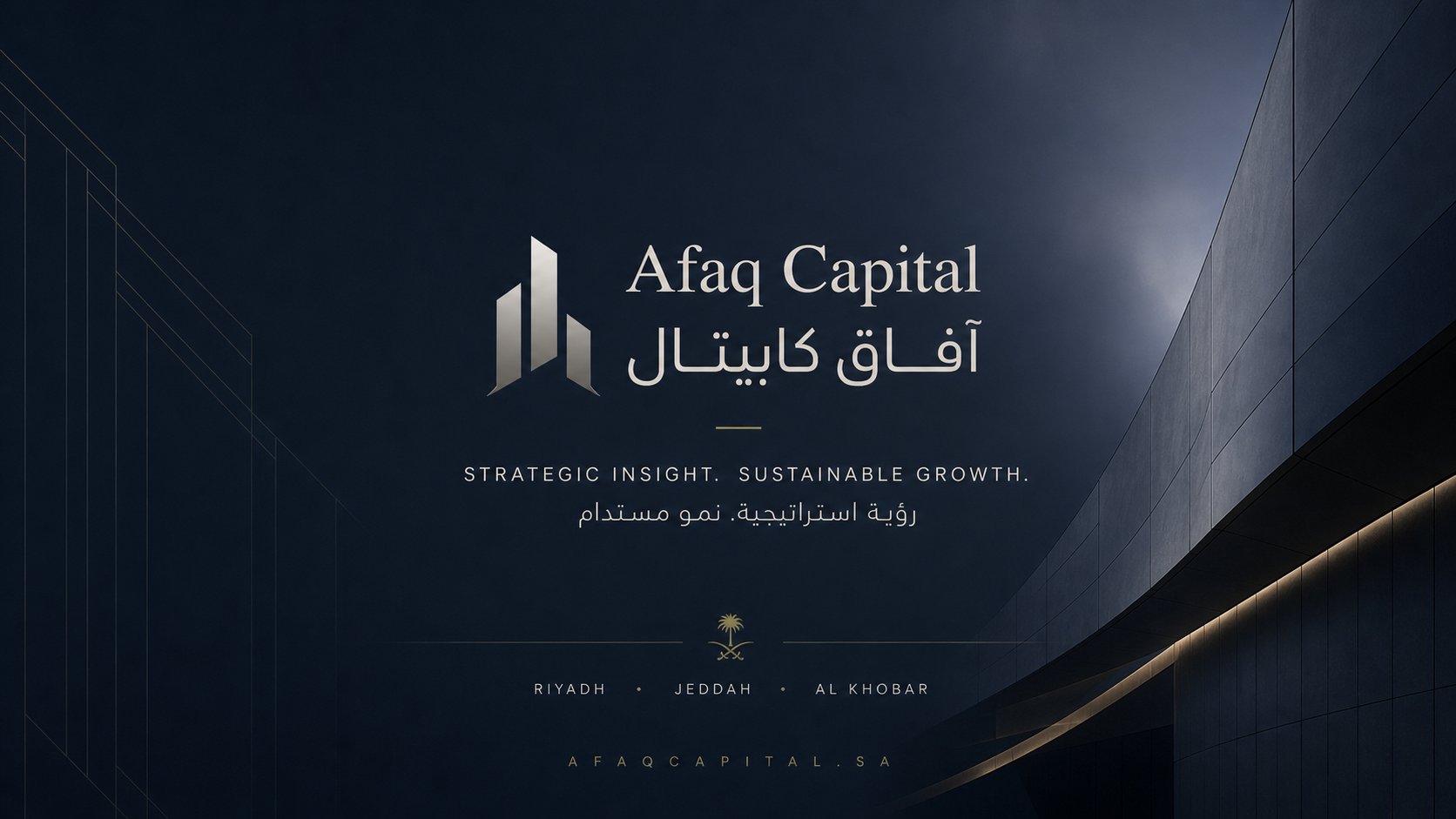
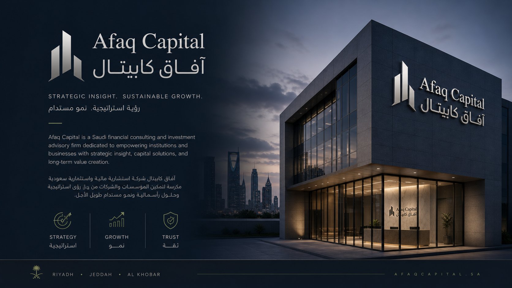
الشريحة الختامية — الإطلالة الكاملة للهوية في بيئتها المعمارية، تختصر فلسفة العلامة: "رؤية استراتيجية. نمو مستدام." بحضور بصري راقٍ ومدن النشاط (الرياض، جدة، الخبر).
Closing slide — the full identity in its architectural context, summarizing the brand philosophy: "Strategic Insight. Sustainable Growth." with a refined visual presence and operating cities (Riyadh, Jeddah, Al Khobar).
التحديChallenge
المعادلة الصعبة
The Tough Equation
قطاع الاستشارات المالية في الخليج مزدحم بهويات تشبه بعضها: كحلي وذهبي ورموز معمارية. التحدي كان مزدوجاً: أولاً، صناعة هوية تتميّز عن المنافسين دون التضحية بالـ "Codes" البصرية المتوقعة في عالم رأس المال. ثانياً، تحقيق توازن بصري ثنائي اللغة بين خط لاتيني كلاسيكي راقٍ (Playfair) وخط عربي حديث ومتسق معه (Tajawal) — وهي معضلة تواجه أغلب الهويات السعودية الراقية.
The financial advisory sector in the Gulf is crowded with similar-looking brands: navy, gold, architectural symbols. The challenge was twofold: first, creating an identity that stands out from competitors without abandoning the visual "codes" expected in the world of capital. Second, achieving a bilingual visual balance between a classic refined Latin typeface (Playfair) and an Arabic typeface that pairs harmoniously with it (Tajawal) — a problem most premium Saudi brands face.
الحلSolution
رؤيتنا الإبداعية
Our Creative Vision
صممنا الشعار حول ثلاثة أبراج معمارية صاعدة تحمل دلالات الاستراتيجية والنمو والثقة، بمعالجة معدنية فضية تكسر النمط الذهبي السائد. اعتمدنا الكحلي الداكن (#0B1A2B) كلون أساسي بدل الكحلي التقليدي، واستخدمنا الذهبي بحدود محسوبة كلكنة لا كنغمة سائدة. للتوازن الطباعي، طوّرنا نظاماً هرمياً دقيقاً يضمن أن العنوان العربي والإنجليزي يتنفسان معاً في كل قطعة — من بطاقة الأعمال إلى التقرير السنوي إلى تطبيق الجوال — عبر 11 نقطة تواصل.
We designed the logo around three rising architectural towers carrying meanings of Strategy, Growth, and Trust, with a silver metallic finish that breaks the prevailing gold convention. We anchored the system in Midnight Navy (#0B1A2B) and used gold sparingly as an accent rather than a dominant tone. For typographic balance, we built a precise hierarchy ensuring Arabic and English headlines breathe together on every artifact — from business card to annual report to mobile app — across 11 touchpoints.