عن المشروعAbout the Project
قصة العلامة
The Story
Optic Analytics منصة متقدمة لتحليل البيانات تخدم الشركات التي تسعى لتحويل أرقامها إلى قرارات ذكية. صممنا هويتها لتجسّد ثلاث قيم: الوضوح، الثقة، والسرعة في الفهم.
Optic Analytics is an advanced data analytics platform serving companies that aim to turn raw numbers into smart decisions. We designed its identity to embody three values: clarity, confidence, and speed of understanding.
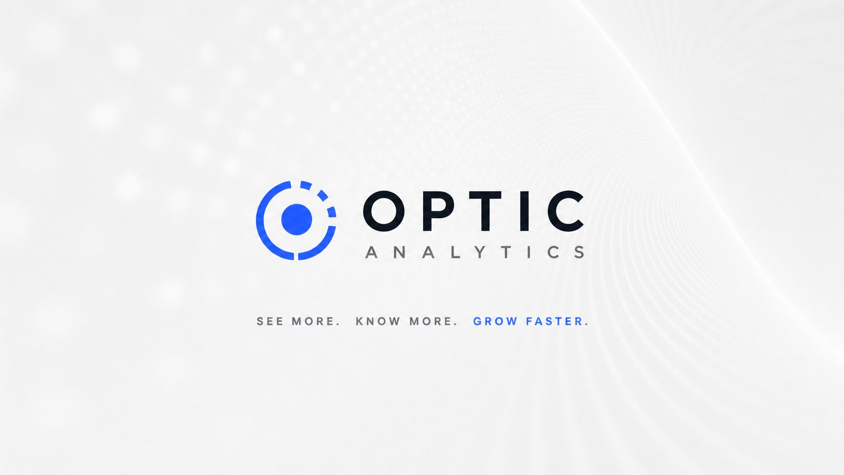
الشعار يجمع بين دائرة العدسة وبؤرة البيانات في تكوين هندسي يوحي بالرؤية الدقيقة، مدعوماً بنظام بصري متكامل من الألوان والخطوط والأيقونات وعناصر بيانية تنبض بالحركة.
The logo combines a lens-like circular form with a data focal point in a geometric composition that suggests precise vision, supported by a complete visual system of colors, typography, icons, and dynamic data-driven graphics.
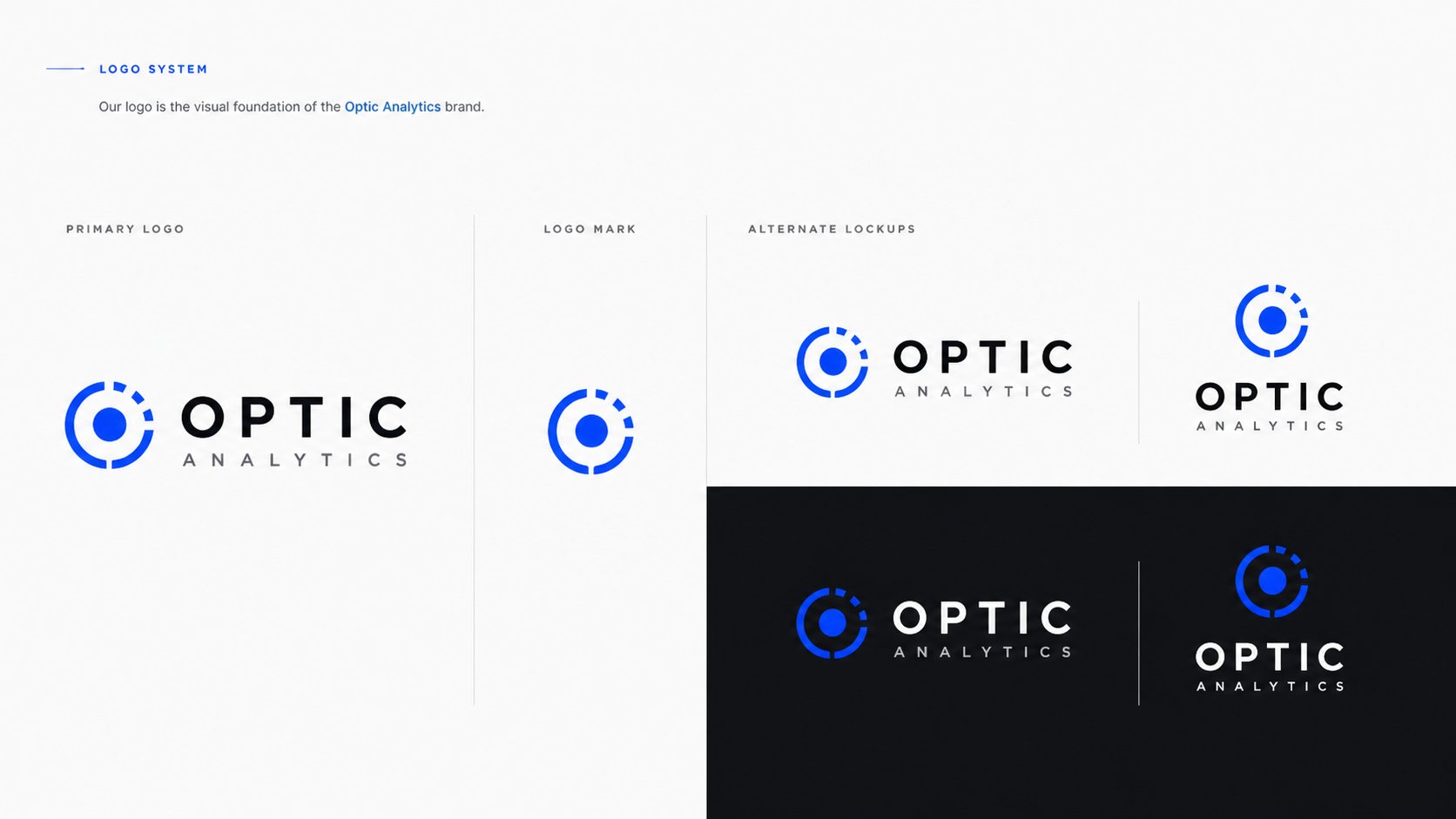
نظام الشعار — الشعار الأساسي، الرمز المختصر (Logo Mark)، والتنويعات البديلة على خلفيات فاتحة وداكنة لمختلف الاستخدامات.
Logo system — primary logo, logo mark, and alternate lockups on light and dark backgrounds for various use cases.
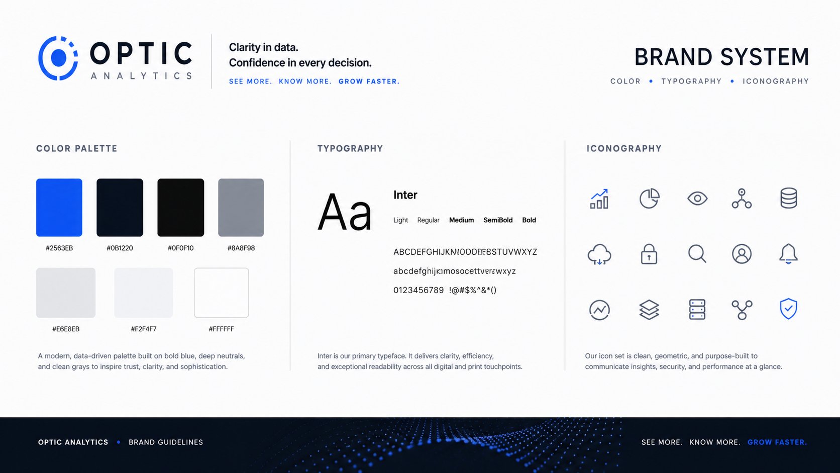
نظام العلامة الكامل — لوحة الألوان (الأزرق الكهربائي، الأسود العميق، تدرجات الرمادي)، خط Inter بأوزانه المختلفة، ومكتبة الأيقونات الهندسية.
Complete brand system — color palette (electric blue, deep black, neutral grays), Inter typeface in multiple weights, and the geometric iconography library.
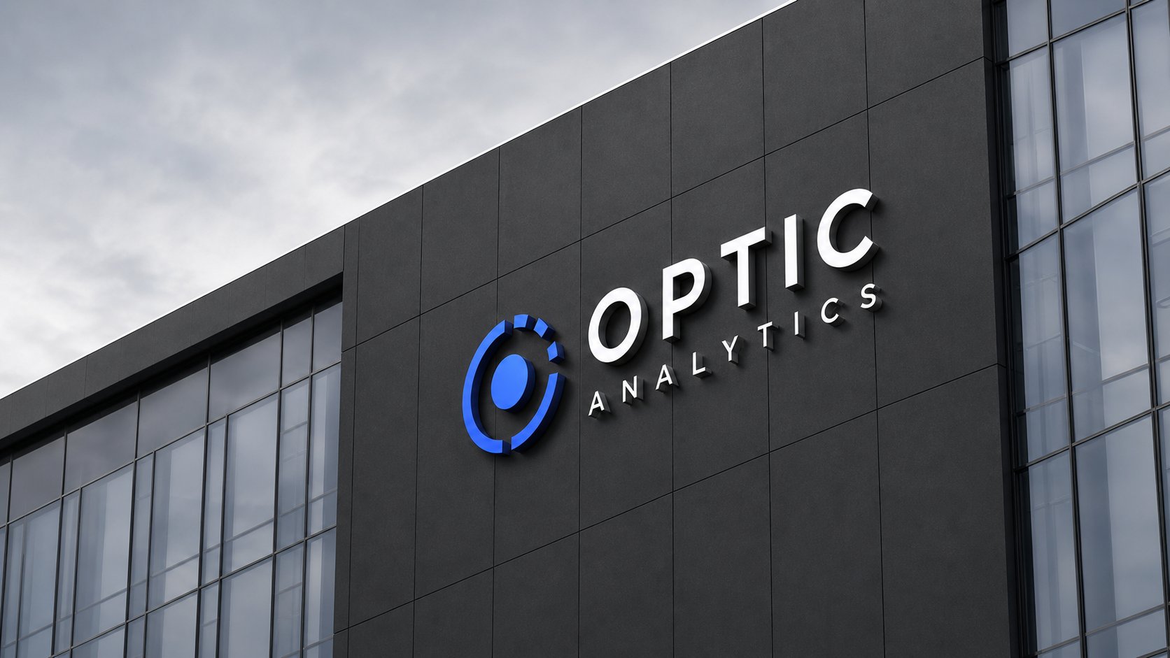
التطبيقات المعمارية — تركيب الشعار ثلاثي الأبعاد على واجهة مقر الشركة بإضاءة احترافية تبرز قوة العلامة في البيئة المحيطة.
Architectural application — 3D logo signage installed on the company headquarters façade with professional lighting that elevates brand presence in its environment.
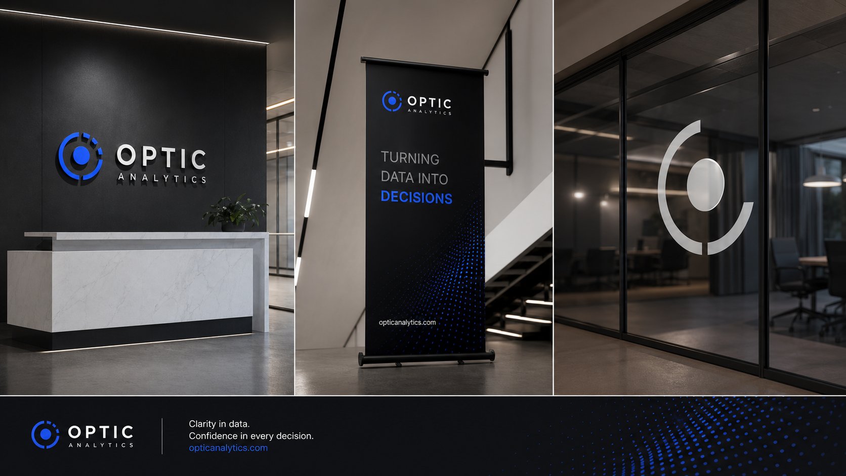
البيئة المكتبية الداخلية — لوحة الاستقبال، البنر الإعلاني الداخلي بشعار "Turning Data into Decisions"، وتصميم الفصل الزجاجي بالشعار المنحوت.
Interior office environment — reception wall signage, indoor banner with the "Turning Data into Decisions" tagline, and frosted glass partition with the etched logo mark.
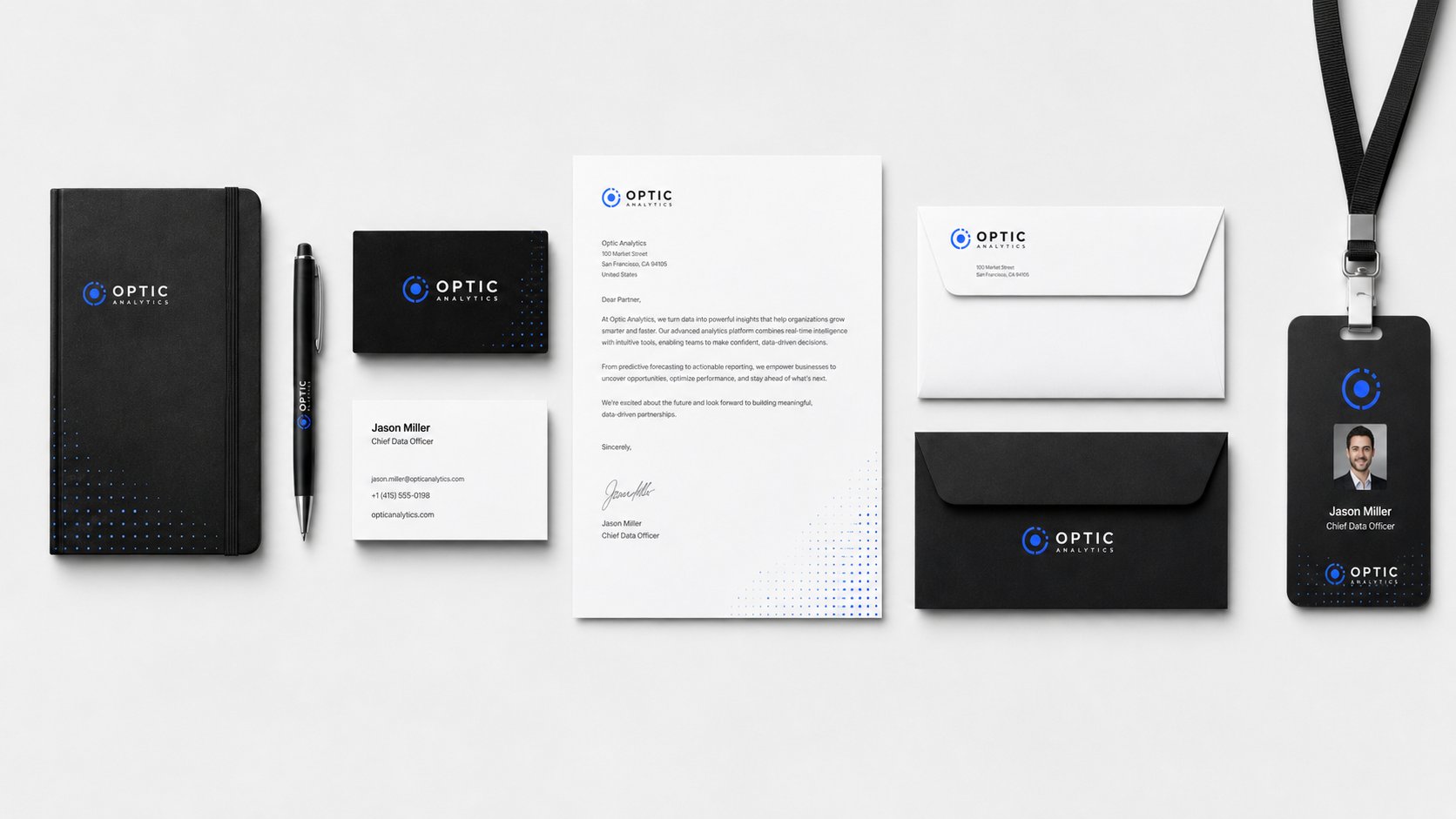
القرطاسية الرسمية — بطاقات الأعمال، الأوراق الرسمية، الأظرف، الدفاتر، والبطاقات التعريفية بنمط بصري موحّد يعكس الاحترافية والاتساق.
Corporate stationery — business cards, letterhead, envelopes, notebooks, and ID badges in a unified visual style that reflects professionalism and consistency.
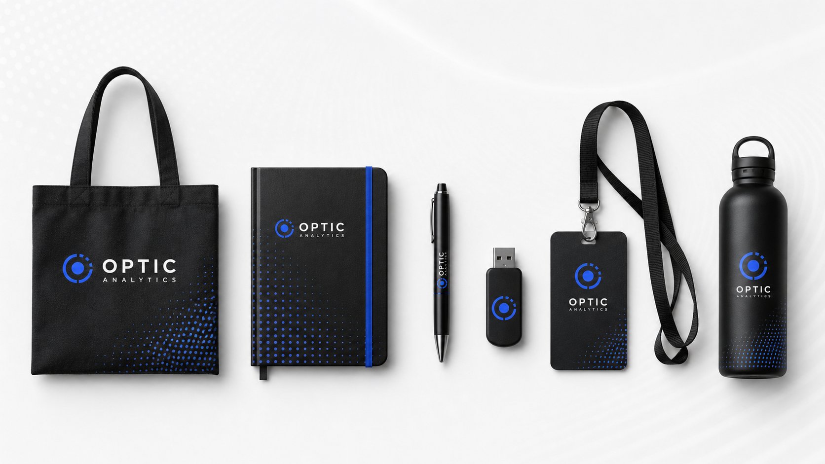
الهدايا الترويجية — حقيبة قماشية، دفتر، قلم، فلاش USB، بطاقة تعريف، وقارورة ماء معدنية بنمط النقاط المتدرجة المميز للعلامة.
Branded merchandise — tote bag, notebook, pen, USB drive, ID badge, and stainless water bottle featuring the brand's signature gradient dot pattern.
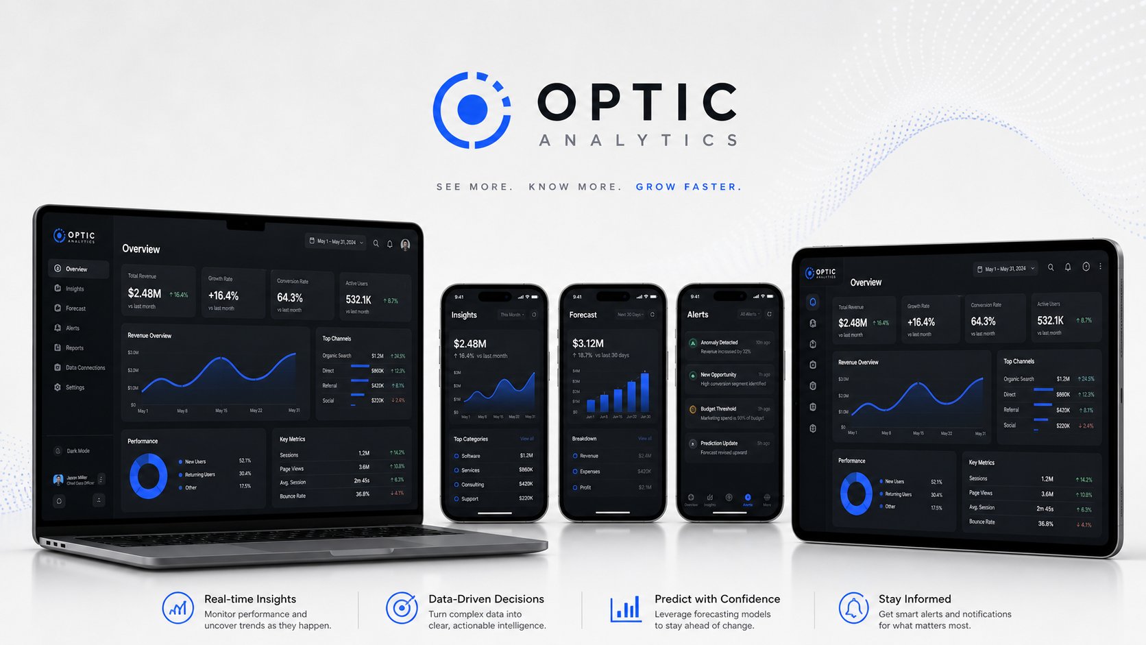
المنصات الرقمية — لوحة تحكم تحليلية شاملة على لابتوب، تابلت، وثلاثة شاشات هاتف تعرض الإحصاءات، التوقعات، والتنبيهات بتصميم داكن متناسق.
Digital platforms — full analytics dashboard across laptop, tablet, and three mobile screens showcasing insights, forecasts, and alerts in a coherent dark UI.
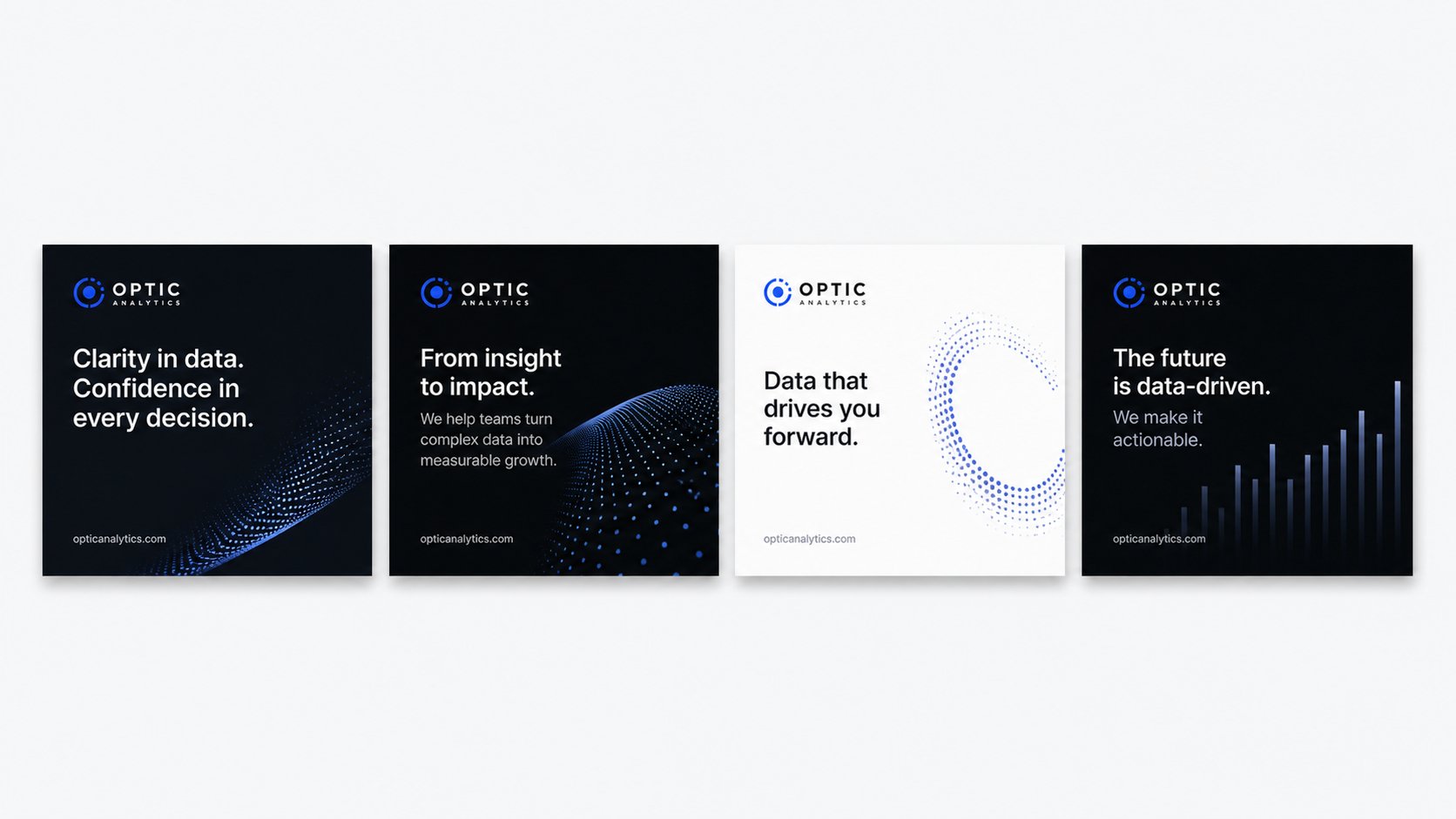
حملات السوشال ميديا — أربع منشورات إعلانية بشعارات متنوعة (Clarity in data، From insight to impact، Data that drives you forward، The future is data-driven) بنمط بصري موحّد.
Social media campaigns — four ad creatives with varied taglines (Clarity in data, From insight to impact, Data that drives you forward, The future is data-driven) in a unified visual style.
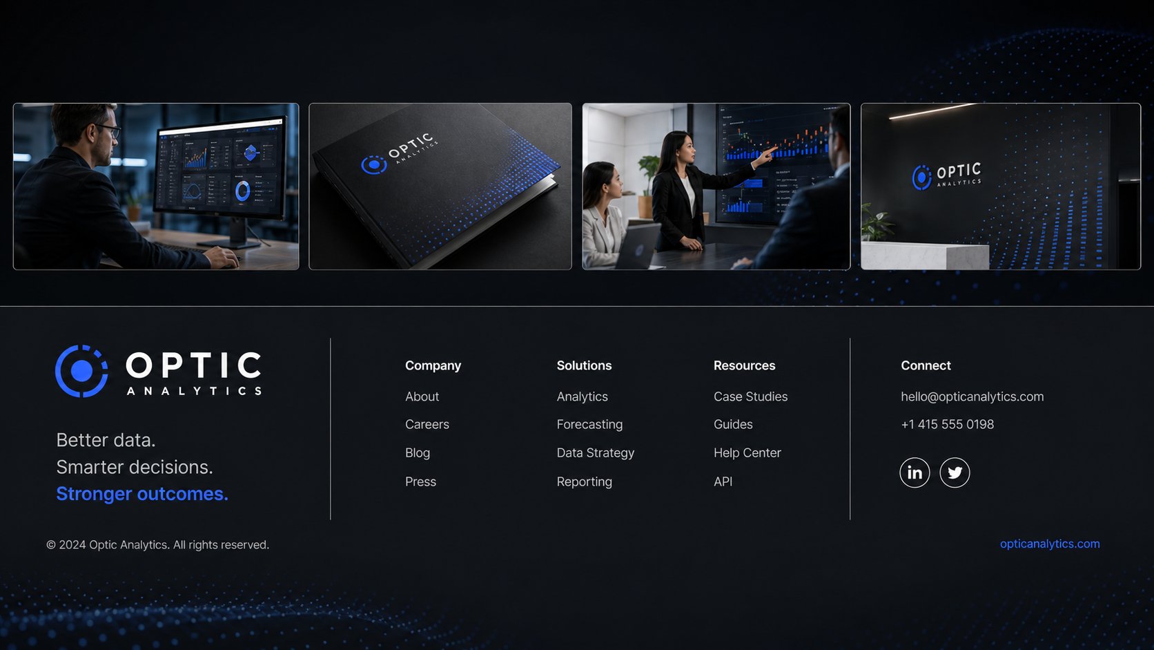
الموقع الإلكتروني — تذييل الموقع الرسمي بأقسام الشركة والحلول والمصادر، مع معرض صور للمنتج في الاستخدام الفعلي يعكس قوة المنصة في بيئات العمل الحقيقية.
Corporate website — official site footer with company, solutions, and resources sections, plus a product-in-use gallery that demonstrates the platform's strength in real work environments.
التحديChallenge
المعادلة الصعبة
The Tough Equation
شركات تحليل البيانات تتشابه بصرياً — معظمها يستخدم الأزرق وتدرجات الرمادي والرسوم البيانية النمطية. التحدي كان: كيف نصنع هوية مميزة تعكس "الوضوح" و"الذكاء" و"السرعة" في آن واحد، دون الوقوع في الكليشيهات السائدة في القطاع التقني؟
Data analytics companies tend to look alike — most rely on blue, gray gradients, and stock-style charts. The challenge was: how do we build a distinctive identity that conveys clarity, intelligence, and speed all at once, without falling into the visual clichés common in the tech sector?
الحلSolution
رؤيتنا الإبداعية
Our Creative Vision
بنينا الشعار حول استعارة "العدسة البصرية" — دائرة منقطعة تحيط ببؤرة زرقاء، توحي بالرؤية والتركيز. وظّفنا الأزرق الكهربائي (#2563EB) رمزاً للذكاء والثقة، مع نمط نقاط متدرجة يعكس تدفّق البيانات. كل عنصر، من الأيقونات إلى الـ UI إلى المطبوعات، مبنيّ على شبكة هندسية واحدة تضمن الاتساق عبر 9 نقاط تواصل مختلفة.
We built the logo around an "optical lens" metaphor — a segmented circle surrounding a blue focal point that conveys vision and focus. Electric blue (#2563EB) was chosen as a symbol of intelligence and trust, paired with a gradient dot pattern that mirrors the flow of data. Every element — from icons to UI to print — is built on the same geometric grid, ensuring consistency across nine different brand touchpoints.